Effect #078 in our rendered series
Glyph trail cursor
A cursor sweeps along a double wave and leaves evenly spaced glyphs that pop, drift down and fade out.
Rendered by us at 1920x1080 over a shot from Tears of Steel (Blender Foundation, CC-BY 3.0). Expand plays the full 1080p file.
Edit in Premiere, Resolve or After Effects? Jump to editor templates. Making many versions of the same video? Use the code route.
Make this effect with
Built and tested by us
Other ways, not tested by us
Use it in a real edit
The demo above already plays the composition over real footage: the clip is a muted <video> layer under the graphics (the file plate.mp4 in the code below). Replace that file with your own clip and render again. To use the graphics in an editor instead, switch the background off and render a transparent MOV (an H.264 MP4 cannot carry transparency):
npx hyperframes render . -o overlay.mov --format mov --fps 24 --variables '{"plate":false}'The routes in full
With Claude Code: the prompt we used
Rendered and tested by us in HyperFrames 0.8.10 on Nov 7, 2026.
Write a HyperFrames clip where a cursor sweeps along a curve and leaves a trail of small glyphs that fade out behind it. Make the trail colour and the glyph set variables.
What changed since this prompt: the demo on this page is our second version, 5 seconds long, rebuilt on a shot from Tears of Steel with the same animation idea. The full composition below is the one we rendered; its build log lists every change.
Built by a Claude Code subagent (Sonnet) from the HyperFrames registry block cursor-glyph-trail, HyperFrames 0.8.10. Claude Code then checked the composition with hyperframes lint and hyperframes check before we rendered it.
What we had to correct (7 notes from the build log):
- Run 1 (2026-11-06): 0 errors, 0 warnings. No corrections needed by lint.
- Glyphs are inline SVG shapes (star, spark, heart, dot, diamond), not font characters, so they render the same everywhere. Seeded random (mulberry32) gives size and rotation. Glyph times come from inverting the cursor ease, so each one is born as the cursor passes.
- Decided against: a mock-app logo or any real brand text; only template words are used.
- lint 0 errors, 0 warnings. hyperframes check: "Check passed" (the only layout items are info lines about the shared background plate drifting past its frame, by design).
- Flash check (WCAG 2.3.1 approximation, whole loop): pass, 0 general and 0 red flashes per second.
- Four 1920 px frames looked at by eye across the loop: no clipped object, no text overlap, no stray mark, contrast fine at settled frames. No fault found, nothing changed.
- Every number on screen comes from our own measured test results (labelled Measured by us, 2026); frames and the poster were checked by eye.
With HyperFrames code
Rendered and tested by us in HyperFrames 0.8.10 on Nov 7, 2026.
npx hyperframes add cursor-glyph-trail
npx hyperframes render . -o out.mp4 --fps 24
Settings you can change without rebuilding (pass them with --variables):
| Setting | Name | Type | Default |
|---|---|---|---|
| Trail colour | color | color | #ffd84d |
| Glyph set | glyphs | enum | stars |
| Glyph count | density | number | 26 |
| Show background | plate | boolean | true |
Our full composition (index.html, 8 KB)
<!doctype html>
<html lang="en" data-composition-variables='[{"id": "color", "type": "color", "label": "Trail colour", "default": "#ffd84d"}, {"id": "glyphs", "type": "enum", "label": "Glyph set", "default": "stars", "options": [{"value": "stars", "label": "Stars and sparks"}, {"value": "hearts", "label": "Hearts"}, {"value": "dots", "label": "Dots"}, {"value": "mixed", "label": "Mixed shapes"}]}, {"id": "density", "type": "number", "label": "Glyph count", "default": 26, "min": 8, "max": 40}, {"id": "plate", "type": "boolean", "label": "Show background", "default": true}]'>
  <head>
    <meta charset="UTF-8" />
    <meta name="viewport" content="width=1920, height=1080" />
    <link href="https://fonts.googleapis.com/css2?family=Inter:wght@600;700&family=JetBrains+Mono:wght@500&display=block" rel="stylesheet" />
    <script src="gsap.min.js"></script>
    <style>
      *, *::before, *::after { box-sizing: border-box; margin: 0; padding: 0; }
      html, body { width: 1920px; height: 1080px; overflow: hidden; background: transparent; }
      #root { position: relative; width: 100%; height: 100%; overflow: hidden; background: transparent; }

      #plate { position: absolute; inset: 0; background: radial-gradient(120% 90% at 30% 40%, #1b2335 0%, #0b0d12 70%); overflow: hidden; }
      #world { position: absolute; left: -200px; top: -120px; width: 2400px; height: 1320px; }
      .blob { position: absolute; border-radius: 50%; filter: blur(60px); }
      .b1 { width: 760px; height: 760px; left: 180px; top: 260px; background: #ff5a1f; opacity: 0.35; }
      .b2 { width: 900px; height: 900px; left: 1200px; top: 80px; background: #2f6bff; opacity: 0.45; }
      .grid { position: absolute; inset: 0; background-image: linear-gradient(rgba(255,255,255,0.05) 1px, transparent 1px), linear-gradient(90deg, rgba(255,255,255,0.05) 1px, transparent 1px); background-size: 120px 120px; }
      #cursor { position: absolute; left: 0; top: 0; width: 0; height: 0; z-index: 30; opacity: 0; filter: drop-shadow(0 4px 6px rgba(0,0,0,0.45)); }
      #cursor svg { position: absolute; }

      #glyphs { position: absolute; inset: 0; z-index: 5; }
      .g { position: absolute; opacity: 0; }
      .g svg { position: absolute; inset: 0; width: 100%; height: 100%; fill: currentColor; }


      /* footage plate (v2): real footage, pinned, no generated blobs */
      #plate { background: #000 !important; }
      #world { left: 0 !important; top: 0 !important; width: 1920px !important; height: 1080px !important; transform: none !important; }
      #world .blob, #world .grid { display: none !important; }
      #pv { position: absolute; left: 0; top: 0; width: 1920px; height: 1080px; object-fit: cover; }
      #scrim { position: absolute; inset: 0; background: transparent; }

      /* data family v2: dashboard window over dimmed footage */
      #scrim { background: rgba(4,6,12,0.12) !important; }
      .win { position: absolute; border-radius: 26px; background: rgba(11,15,25,0.94); border: 2px solid rgba(255,255,255,0.16); box-shadow: 0 30px 80px rgba(0,0,0,0.55); overflow: hidden; font-family: "Inter", "Montserrat", sans-serif; }
      .win .bar { position: absolute; left: 0; right: 0; top: 0; height: 64px; background: rgba(255,255,255,0.06); border-bottom: 2px solid rgba(255,255,255,0.10); display: flex; align-items: center; padding-left: 28px; gap: 12px; color: #aab3c5; font-size: 24px; font-weight: 500; }
      .win .bar i { width: 16px; height: 16px; border-radius: 50%; background: #ff5f57; display: block; }
      .win .bar i:nth-child(2) { background: #febc2e; } .win .bar i:nth-child(3) { background: #28c840; }
      .win .bar b { margin-left: 18px; font-weight: 500; }
      .chip { position: absolute; font-family: "Inter", "Montserrat", sans-serif; font-weight: 700; font-size: 26px; padding: 8px 20px; border-radius: 999px; background: rgba(255,210,63,0.14); border: 2px solid #ffd23f; color: #ffd23f; white-space: nowrap; }
    </style>
  </head>
  <body>
    <div id="root" data-composition-id="main" data-start="0" data-duration="5" data-fps="24" data-width="1920" data-height="1080">
      <div id="plate"><div id="world"><video id="pv" src="plate.mp4" muted playsinline data-start="0" data-duration="5"></video><div id="scrim"></div><div class="blob b1" id="b1"></div><div class="blob b2" id="b2"></div><div class="grid"></div></div></div>
      <div id="glyphs"></div>
      <div id="cursor"><svg width="44" height="52" viewBox="0 0 44 52" style="left:-3px;top:-3px"><path d="M3 3 L3 37 L12 29 L18.5 44 L25 41 L18.5 27 L30 27 Z" fill="#ffffff" stroke="#111111" stroke-width="3" stroke-linejoin="round"/></svg></div>
    </div>
    <script>
      window.__timelines = window.__timelines || {};
      (function () {
        const v = window.__hyperframes.getVariables();
        const tl = gsap.timeline({ paused: true });
        if (!v.plate) document.getElementById("plate").style.display = "none";

        const E = (n) => gsap.parseEase(n);
        const rgba = (hex, a) => {
          let h = String(hex).replace("#", "");
          if (h.length === 3) h = h.split("").map((c) => c + c).join("");
          const n = parseInt(h, 16);
          return "rgba(" + ((n >> 16) & 255) + "," + ((n >> 8) & 255) + "," + (n & 255) + "," + a + ")";
        };
        const invEase = (fn, s) => { let lo = 0, hi = 1; for (let i = 0; i < 30; i++) { const m = (lo + hi) / 2; if (fn(m) < s) lo = m; else hi = m; } return (lo + hi) / 2; };
        const mk = (tag, cls, parent, html) => { const e = document.createElement(tag); if (cls) e.className = cls; if (html != null) e.innerHTML = html; parent.appendChild(e); return e; };

        const root = document.getElementById("root");
        const SHAPES = {
          star: "M12 1.5l3 7 7.5.7-5.7 5 1.8 7.4L12 17.7 5.4 21.6l1.8-7.4-5.7-5L9 8.5z",
          spark: "M12 1l2.6 8.4L23 12l-8.4 2.6L12 23l-2.6-8.4L1 12l8.4-2.6z",
          heart: "M12 21s-8.5-5.4-8.5-11.2C3.5 6.6 5.8 4.5 8.4 4.5c1.5 0 2.8.8 3.6 2 .8-1.2 2.1-2 3.6-2 2.6 0 4.9 2.1 4.9 5.3C20.5 15.6 12 21 12 21z",
          dot: "M12 5a7 7 0 1 0 0 14a7 7 0 1 0 0-14z",
          diamond: "M12 2l8 10-8 10-8-10z"
        };
        const SETS = { stars: ["star", "spark"], hearts: ["heart"], dots: ["dot"], mixed: ["star", "heart", "dot", "diamond"] };
        const set = SETS[v.glyphs] || SETS.stars;
        const n = Math.max(8, Math.min(40, Math.round(Number(v.density) || 26)));
        function mulberry32(a) { return function () { a |= 0; a = (a + 0x6d2b79f5) | 0; let t = Math.imul(a ^ (a >>> 15), 1 | a); t = (t + Math.imul(t ^ (t >>> 7), 61 | t)) ^ t; return ((t ^ (t >>> 14)) >>> 0) / 4294967296; }; }
        const rnd = mulberry32(7);
        // the curve: a long double wave across the frame, well inside the margins
        const P = (s) => [270 + 1380 * s, 540 + 210 * Math.sin(2 * Math.PI * 1.25 * s + 0.4)];
        const T0 = 0.5, DUR = 2.9, EASE = "power1.inOut", fn = E(EASE), SEG = 72;

        tl.set("#cursor", { x: P(0)[0], y: P(0)[1], transformOrigin: "3px 3px" }, 0);
        tl.to("#cursor", { opacity: 1, duration: 0.3, ease: "power1.out" }, 0.1);
        for (let k = 1; k <= SEG; k++) {
          const p = P(fn(k / SEG));
          tl.to("#cursor", { x: p[0], y: p[1], duration: DUR / SEG, ease: "none" }, T0 + DUR * (k - 1) / SEG);
        }
        // glyphs are spaced evenly along the curve and born as the cursor passes
        const host = document.getElementById("glyphs");
        const LIFE = 1.0;
        for (let i = 0; i < n; i++) {
          const s = (i + 0.5) / n, pt = P(s), size = 30 + Math.round(rnd() * 22), rot = Math.round(rnd() * 60 - 30);
          const g = mk("div", "g", host, '<svg viewBox="0 0 24 24"><path d="' + SHAPES[set[i % set.length]] + '"/></svg>');
          g.style.width = g.style.height = size + "px";
          g.style.left = pt[0] - size / 2 + "px"; g.style.top = pt[1] - size / 2 + "px";
          g.style.color = v.color;
          const ts = T0 + DUR * invEase(fn, s) + 0.04;
          tl.fromTo(g, { opacity: 0, scale: 0.2, rotation: rot, y: 0 }, { opacity: 1, scale: 1, rotation: rot + 25, duration: 0.18, ease: "back.out(2)" }, ts);
          tl.to(g, { y: 36, duration: LIFE, ease: "power1.out" }, ts);
          tl.to(g, { opacity: 0, scale: 0.5, duration: LIFE - 0.25, ease: "power1.in" }, ts + 0.25);
        }
        // cursor drifts off the end of the curve and fades
        tl.to("#cursor", { opacity: 0, duration: 0.3, ease: "power1.in" }, T0 + DUR + 0.1);


        window.__timelines["main"] = tl;
      })();
    </script>
  </body>
</html>
With Remotion
We have not built this effect in Remotion. If you use it, read its licence first: Individuals (personal or commercial use), organisations or teams with a total headcount of 3 or less, non-profits, and anyone evaluating Remotion before commercial use. A company does not qualify merely because it is unprofitable. Everyone not eligible for the Free License needs a Company License. Remotion licence FAQ, checked Nov 4, 2026.
In your editor: Premiere, Resolve, After Effects, CapCut
We have not reviewed an editor template for this effect yet.
Variations
The same composition rendered again with different settings. Nothing was rebuilt.
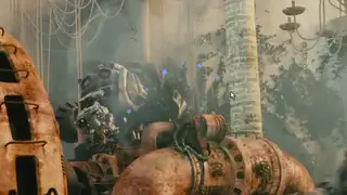
{"color":"#7aa7ff","density":14}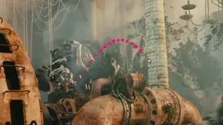
{"color":"#ff2d6f","glyphs":"hearts","density":36}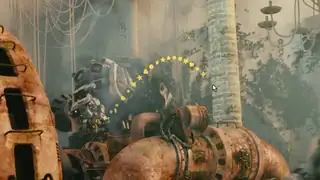
{"glyphs":"mixed","density":40}Spec and test details
- Engine
- HyperFrames 0.8.10, GSAP 3.14.2 (local copy)
- Length and frame rate
- 5 seconds at 24 fps, rendered at 1920x1080
- Video files on this page
- H.264: 1920x1080 for Expand (5594.7 KB), 1280x720 in the page (2256.6 KB), 640x360 in galleries (414.3 KB), no audio
- Picture check
- The 1080p file scores VMAF 99.49 against our render master and keeps 101% of its edge detail (measured by us with FFmpeg libvmaf and OpenCV)
- Footage
- orange robot machinery in an overgrown hall, steam, wide (Tears of Steel, 8:41)
- Tested in editors
- None yet
- Flash check
- Passed: at most 2 general and 0 red flashes in any second. automated approximation of WCAG 2.3.1 on a 96x54 grid, whole loop including the restart; not a certification.
- Licence
- Composition adapted by us from the HyperFrames registry (Apache-2.0); text fonts from Google Fonts under the SIL Open Font License.
- Last tested
- Nov 7, 2026
- Machine
- Laptop: AMD Ryzen 7 7735U (8 cores, 16 threads), 31 GB RAM, Windows 11 Home; CPU rendering
Technical details: render times and file sizes
- Render of the 5-second master: 65.8 s (2 render workers, on the laptop above).
- full.mp4: 5594.7 KB
- hero.mp4: 2256.6 KB
- hero.webp: 69.2 KB
- tile.mp4: 414.3 KB
- tile.webp: 25.1 KB
- Variation "subtle": rendered in 53.8 s, 412.8 KB
- Variation "bold": rendered in 58.1 s, 416.4 KB
- Variation "mixed": rendered in 54.2 s, 416.5 KB
Credits
- Built from the HyperFrames registry component cursor-glyph-trail by HeyGen (Apache-2.0), adapted by us.
- Fonts from Google Fonts, under the SIL Open Font License.
- Footage: Tears of Steel, (c) Blender Foundation, mango.blender.org, licensed CC-BY 3.0. We cropped the shots to 16:9 and laid our graphics over them.
- Editor templates and other routes on this page belong to their creators, who are credited on each card.
Related effects and jobs
Page checked on Nov 4, 2026.